
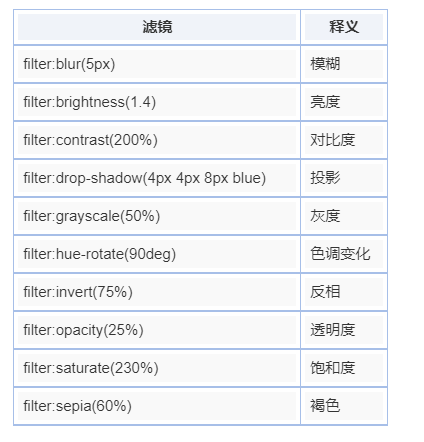
filterfilter 属性中有一个叫 grayscale 的属性,它有什么惊人的作用呢? 下面来揭晓一下根据我咨询的一个交互设计师透露,在一般的开发中,做类似徽章或者有图片置灰或者正常显示来表示状态的时候,开发会找他们要这两种状态的图片,其实,这是完全用不着的~
比如在上面讲到的做徽章效果的 case 里我们如果有四种勋章,那我们就要用八张图片,如果有八种状态,那么我们就要十六张图片,多!可!怕!
这么多图片我们都已经可以预想到我们的文件体积了
现在让我们用一行 css 代码来搞定它
1 | div .image:hover { |
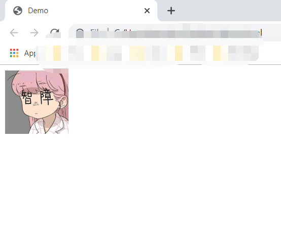
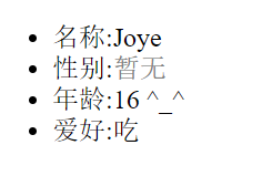
正常显示:
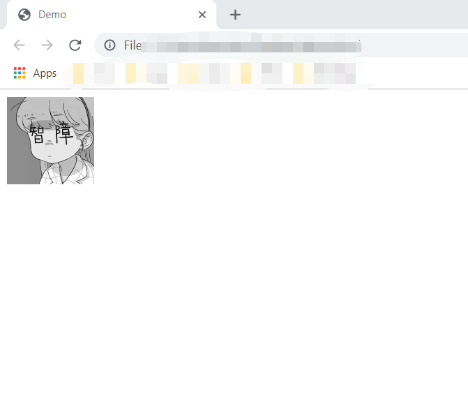
鼠标悬停置灰显示:
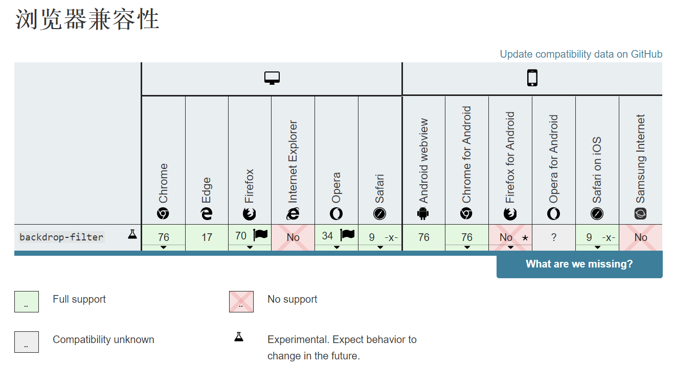
根据MDN上对该属性浏览器支持度的统计,我们可以看出来 PC 除了(IE),手机只考虑 IOS 和 安卓的话是全部支持的, very nice~
backdrop-filter 又叫背景滤镜,那么他和上面的 filter 有什么不同呢?
backdrop-filter 会让该元素所在区域后面的内容模糊之类的,而 filter 元素则是作用于该元素本身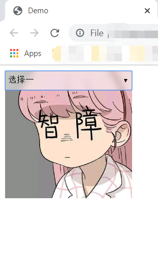
这个毛玻璃的效果就非常明显了~
两个非常实用而小众的东西
方式一: table
1 | <style> |
方法二:position
1 | <style> |
方法三:float
1 | <style> |
方法四: BFC (唯一不需要对父级进行设置的方法)
1 | <style> |
方法五:flex
1 | <style> |
方法六:grid
1 | <style> |
有时候我们在页面也需要埋点,根据业务需求去统计一些数据,在遇到禁止执行 js 的浏览器的时候就会很麻烦。所以用 css 会更畅通无阻一些。
例如:
1 | .button-1:active::after { |
1 | <div id="content"></div> |
1 | <div id="content"></div> |
1 | <style> |